Our major releases tend to have a particular theme, usually a big new feature that’s been added. For Jiglu 14, though, we instead went through the entire product to find all the things we thought weren’t as easy to use as they should be, weren’t quite as useful as we thought they ought to be or could be improved in some way.
Here’s some of the biggest enhancements we’ve made.
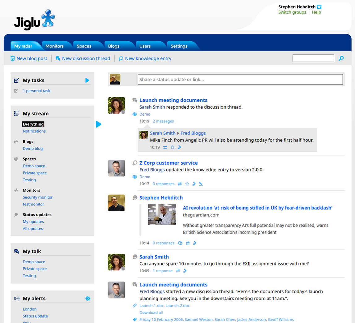
Jiglu Radar
Jiglu Radar is the personal home page for each user, showing them the latest things that have been happening in all the groups that they are a member of. For Jiglu 14 we removed clutter from the edges and ensured the focus was on the activity stream as the place to go for updates on what’s new for you and for notifications about how people are interacting with the content that you’ve personally added. Moderators will also find they can do more actions without leaving the page.

We’ve brought the daily email newsletters that users can subscribe to into line with the radar, so you get the exact same updates whether you’re on the web or catching up from email.
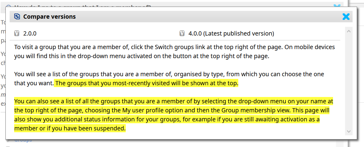
Version comparisons
For blog posts and wiki entries Jiglu has a version control system. This sits in the background keeping track of changes that are made, ensuring authors don’t overwrite each other’s work and letting them go back to earlier versions if they need to. With Jiglu 14 you can now see the differences between versions, with the text marked up with the changes and a list of attachments and other things that differ.

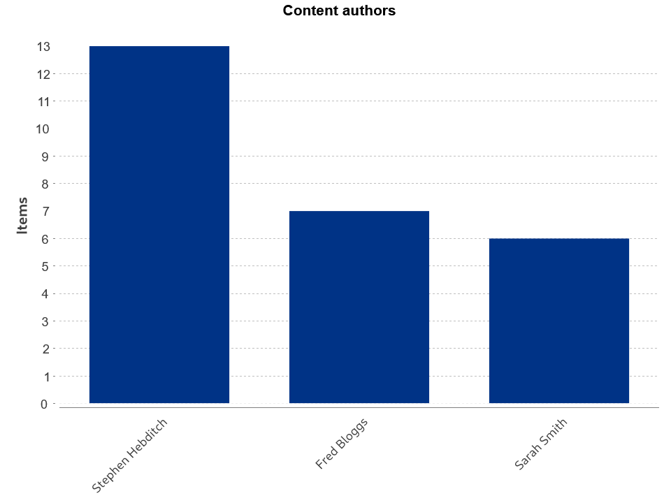
Content analytics
Insight is the place to go in a Jiglu group for analytics on how content is being used, where it’s coming from and what being talked about. For Jiglu 14 we’ve beefed this up, with new charts that give additional ways to understand the content and new ways of segmenting the information.

Within collaboration spaces you’ll find useful new visualisations that let you see what topics a particular author contributes most and how a tag relates to others.
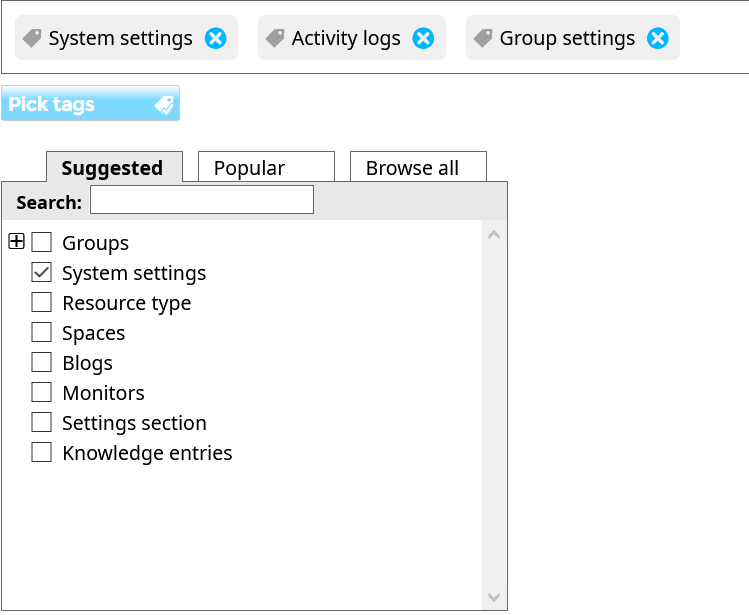
Automated tagging
Jiglu Dynamic Discovery is our automated tagging engine, which analyses the content in groups and creates tags that represent it, allowing you to follow connections between different pieces of information. For Jiglu 14 we took a fresh look at how the engine was working on today’s content and made lots of small changes designed to ensure the tags really are those that best represent the content.

We also revamped the interface that lets users choose tags manually for blog posts and wiki entries to make it easier to use and more accessible. For tags that come in from outside, such as from feeds, we ensured they are consistent with those the system itself generates.
Security enhancements
With every recent release we’ve progressively added more defences against unauthorised activity and Jiglu 14 is no exception. New protections include locking out brute-force attempts at password cracking, keeping the most sensitive parts of the system fully secure and improving feedback to users when there have been attempts to get into their accounts. We’ve also made setting up two-factor authentication simpler and safer so there’s no excuse not to use it.
The rest
There’s also lots of smaller improvements. The user interface has been made more consistent throughout and some accessibility gaps have been addressed. We’ve further improved how we can support corporate data policies with new settings controlling content retention. Behind the scenes, Jiglu is faster and more memory efficient and better recovers on its own from external failures.
There’s lots more besides – if you’re interested in seeing the full details then check out the release notes.
If you haven't tried Jiglu yet then find out how to get started. You can also drop us a line if there's anything you'd like to know more about.